Design people can feel.

A thoughtful visual language gives people a clear way in, a reason to trust, and a next step that makes sense.

From brief to feel.

We make the visual decisions visible before they become expensive to change.

  1. Listen

    We start with the audience, the offer and the tone the business wants to strike.

    A slower stay, beautifully considered.

    A boutique inn for weekends that begin before check-in.

    A quiet room with morning lightA quiet room with morning light
    StoryProofNext step
    Rooms

    Three calm spaces, each with its own rhythm.

    The grounds

    A garden path, a long table, and room to pause.

    Reserve

    Choose your dates and we will take care of the rest.

  2. Visual language

    Type, color, imagery and tone get chosen together, then written down once.

    Simple rituals for everyday skin.

    Plant-based care, made in small batches and sent with intention.

    Stillwater botanical careStillwater botanical care
    StoryProofNext step
    The ritual

    Cleanse, restore, protect. Three considered steps.

    Ingredients

    Familiar plants, clear sourcing, no performance theater.

    Shop

    Find the set that fits your day.

  3. Structure

    The page gets built around how a visitor actually decides, section by section.

    Homes with a sense of place.

    An architecture studio shaping useful, enduring spaces.

    A light-filled residential projectA light-filled residential project
    StoryProofNext step
    Selected work

    A restrained collection of homes and additions.

    Approach

    Listen first. Draw carefully. Build with the site.

    Start a project

    Bring us the place you are imagining.

  4. Craft

    The last pass is the one people feel without naming: spacing, rhythm, the small details.

    Good counsel for what comes next.

    A clear, human approach to business and estate planning.

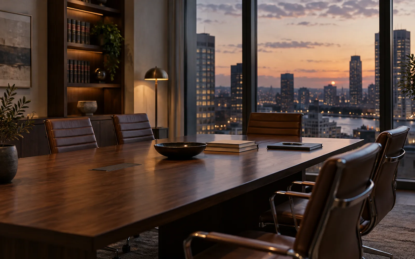
    Copperline consultation roomCopperline consultation room
    StoryProofNext step
    Business

    Practical counsel for decisions with weight.

    Planning

    Protect what you have built and who comes after.

    Talk with us

    A first conversation starts with listening.

A visual language has parts.

Type, color, image, motion and layout each carry a piece of the story.

  • Type

    A headline should sound like the business feels, in one family and a handful of sizes.

  • Color

    Cool, useful contrast with one clear accent, never more than a small named set.

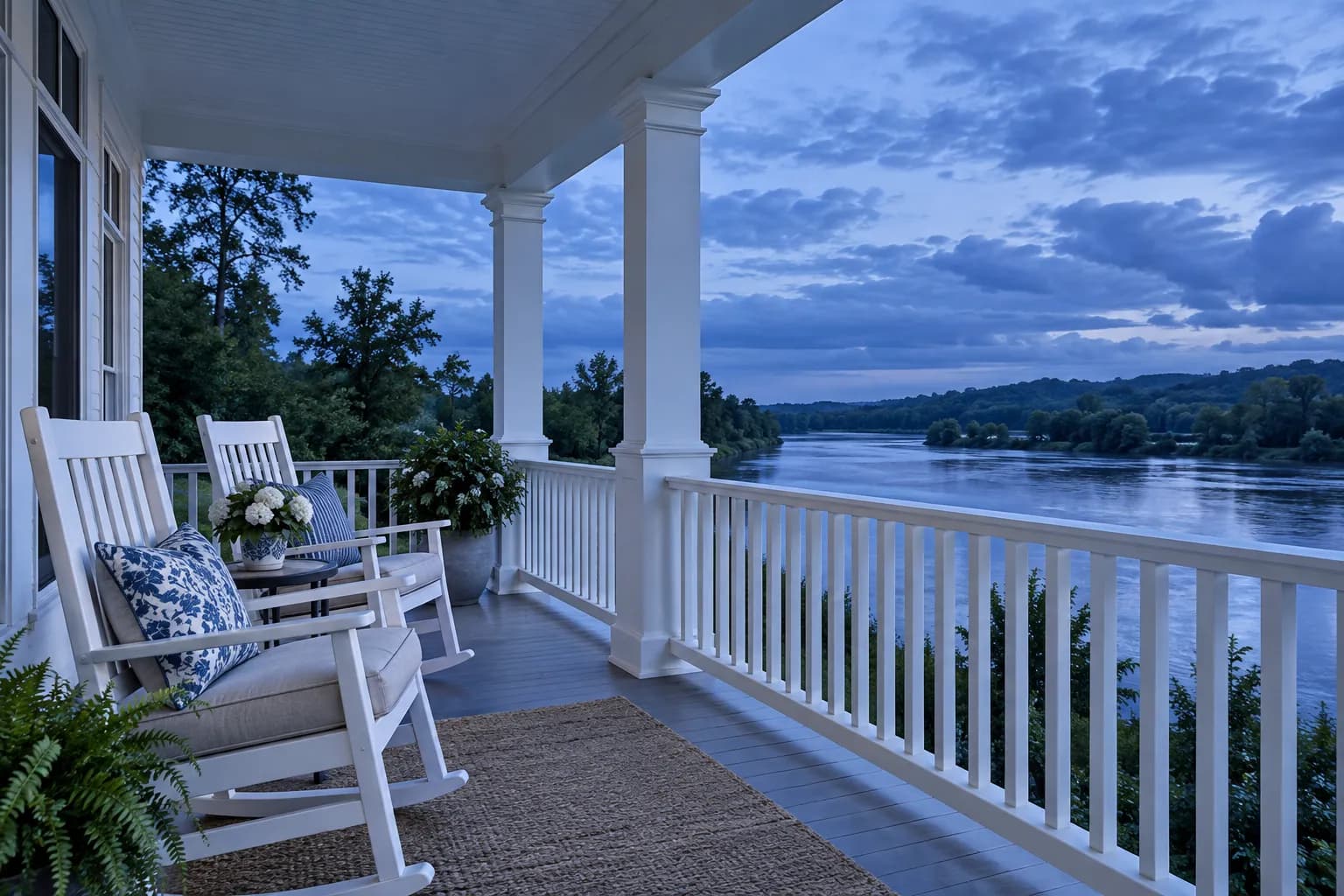
  • A porch above a river at dusk, the photograph behind the Morrow House concept website.

    Concept: Morrow House, a riverside inn.

    Image

    Photography and interface color that give the page a place, not a stock feeling.

  • Motion

    Small movement that explains what changed, never decoration for its own sake.

  • Layout

    Every section earns its position in the visitor’s decision, top to bottom.

A moodboard with a point of view.

Material, tone and restraint become a shared reference before production begins.

Simple rituals for everyday skin.

Plant-based care, made in small batches and sent with intention.

Stillwater botanical careStillwater botanical care
StoryProofNext step
The ritual

Cleanse, restore, protect. Three considered steps.

Ingredients

Familiar plants, clear sourcing, no performance theater.

Shop

Find the set that fits your day.

A slower stay, beautifully considered.

A boutique inn for weekends that begin before check-in.

A quiet room with morning lightA quiet room with morning light
StoryProofNext step
Rooms

Three calm spaces, each with its own rhythm.

The grounds

A garden path, a long table, and room to pause.

Reserve

Choose your dates and we will take care of the rest.
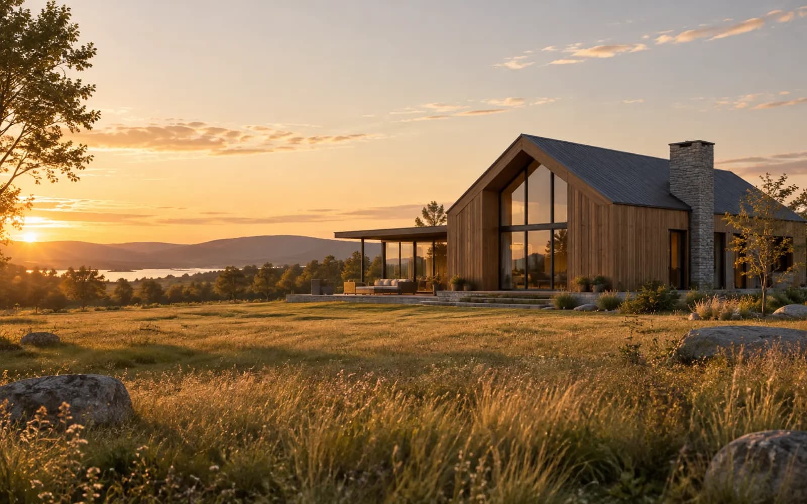
Homes with a sense of place.

An architecture studio shaping useful, enduring spaces.

A light-filled residential projectA light-filled residential project
StoryProofNext step
Selected work

A restrained collection of homes and additions.

Approach

Listen first. Draw carefully. Build with the site.

Start a project

Bring us the place you are imagining.

Designed for people, then for screens.

A responsive design should keep its rhythm when the screen gets small.

  • Thumb reach

    Calls, bookings and menus stay easy to find and use on a phone.

  • Reading rhythm

    The hierarchy survives a narrow screen instead of collapsing into one long scroll.

  • Contrast

    Text stays legible in both light and dark, checked, not assumed.

Same business. Different first impression.

Drag the line, or focus it and use the arrow keys. Both pages are concepts with the same facts.

Good work. Right when you need it.

A home services team that arrives ready and leaves things better.

A Northline technician at workA Northline technician at work
StoryProofNext step
Services

Heating, cooling, and the repairs between.

Our promise

Clear estimates before the work begins.

Request service

Tell us what is happening and we will call back.

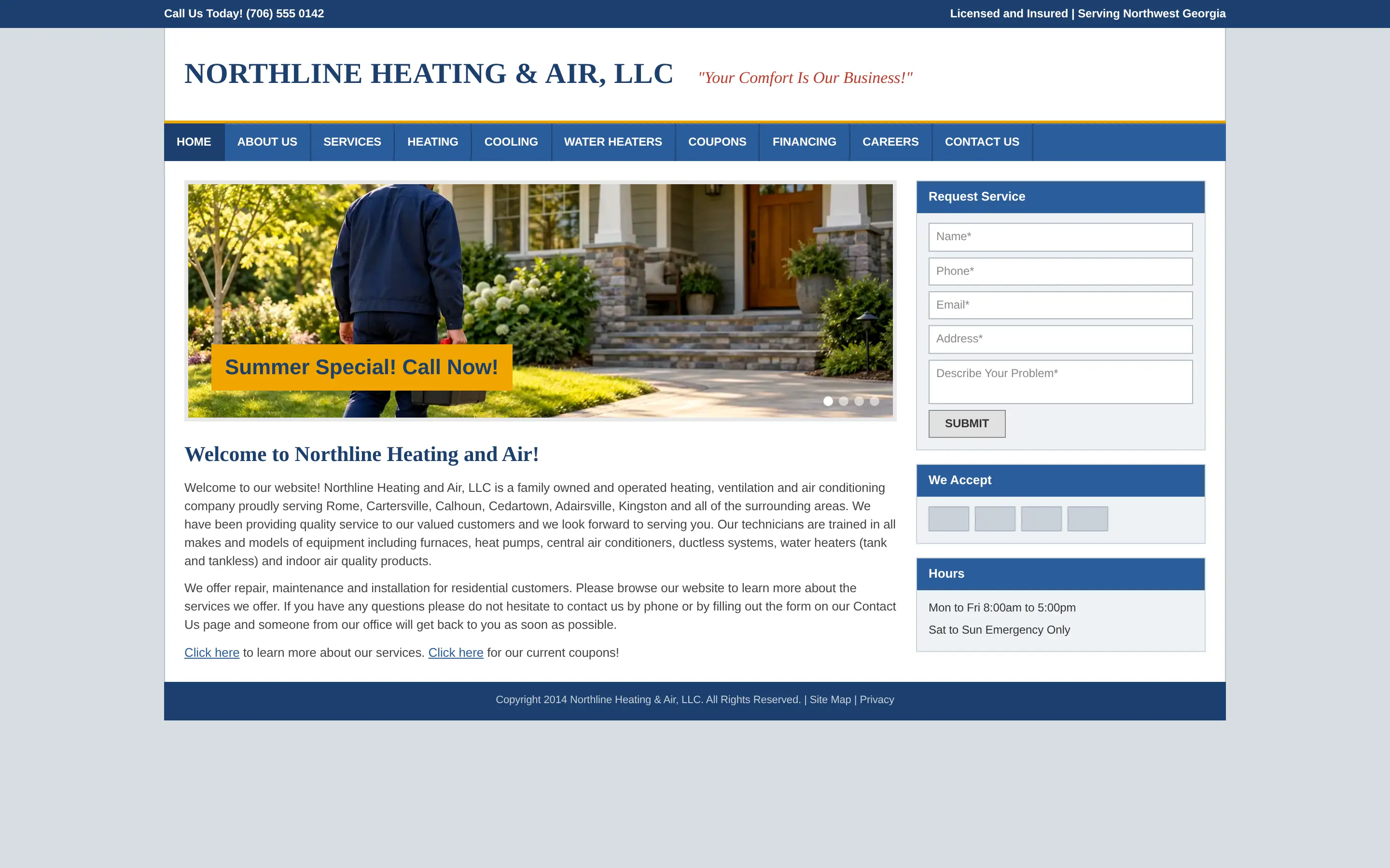
A dated heating and air website: a crowded blue menu, a slideshow and a wall of small gray text.
DatedRedesigned

Concept: Northline, a home services company, before and after.

Questions about web design.

When do I see the visual direction?

The first review brings type, color, imagery and layout together before we produce individual pages.

Can the system grow with our team?

Yes. The handoff includes the reusable type, color and component decisions, so a page added later still looks like the same company.

Do you write the copy too?

We can, or we can build around copy you already have. Either way, the words and the design get reviewed together.

Make the page useful before making it bigger.

A clear design makes a business easier to understand, shows proof quickly and makes the next step feel safe.